Colors, finishes,
and how to pick
the right one.
Powder coating runs on color systems, not paint mixing — which is both the strength and the limitation of the process. This page walks through what we can match, what we stock, what takes extra time, and the finish families that decide how a color actually looks once it's cured.
Color is
a powder batch,
not a paint mix.
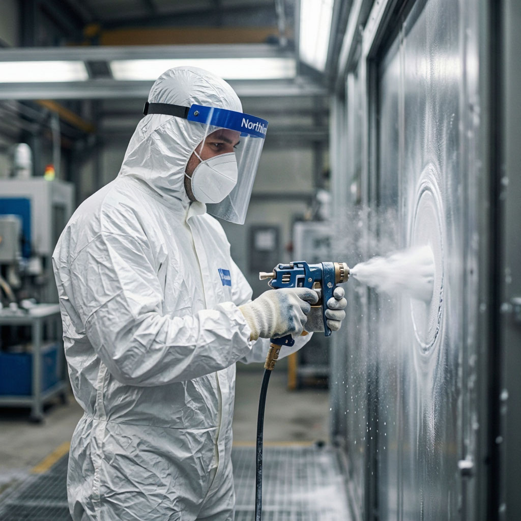
Unlike liquid paint, which can be mixed to any color on demand, powder coating color is set at the factory. Powder manufacturers produce batches of powder in specific colors, and a coater either has that color in stock or orders it from the manufacturer. This means two things: stock colors are cheap and fast, and custom colors take time and money.
The upside is consistency. A stock RAL color from a specific manufacturer is the same color every time you order it — no drift between batches, no mixing variability. That's why architectural projects with strict color requirements almost always spec stock RAL or a manufacturer's stock color rather than a custom formula.
The other variable that matters more than most people realize is gloss level. A gloss black and a satin black and a matte black are all called "black" and look completely different on a finished part. We always confirm gloss level before running a job, and we send a physical sample if there's any ambiguity.
Popular colors we
keep on the shelf.
These are the colors we stock year-round. They ship fastest and cost the least. For any RAL, Pantone, or Federal Standard color not shown here, we can usually order it — most arrive within 5–7 business days.
RAL Classic · most common architectural & industrial colors
Architectural · AAMA 2605 stocked colors
Automotive & Wheel · high durability polyester finishes
Gloss changes
everything.
The same color at different gloss levels can look like three different colors. These are the finish families we run, and what each one is best suited for.
High Gloss
Reflective, easy to clean, and popular for anything that needs to look polished. Shows surface imperfections and dirt more than any other finish.
Best for: wheels, architectural trim, retail fixturesSemi-Gloss
Middle ground between high gloss and satin. Reads almost as glossy but cleans slightly easier and hides more surface variation.
Best for: industrial equipment, enclosures, appliance partsSatin
The current default for automotive wheels and chassis parts. Hides brake dust and road grime better than gloss and has a more premium look than flat.
Best for: automotive, custom work, architectural accentsMatte / Flat
Aggressive, motorsport-inspired look. Harder to keep clean — fingerprints and smudges show easily — but unmatched for the visual impact on the right part.
Best for: track wheels, tactical equipment, accent partsMetallic & Mica
Fine metallic flake suspended in the powder. Depth and shimmer that flat colors can't achieve. Coarse, medium, and fine flake sizes available.
Best for: wheels, automotive accents, high-end furnitureCandy
Metallic base coat plus a transparent colored topcoat. The base reflects through the candy topcoat for a depth that single-stage finishes can't match. Adds 2–3 days and cost.
Best for: show cars, café racers, custom buildsHammertone
Simulates hand-hammered metal surface without any actual hammering. Excellent at hiding weld marks and surface imperfections.
Best for: toolboxes, vintage equipment, industrial furnitureWrinkle
Originally developed for military and industrial equipment. Extremely durable and hides wear better than any smooth finish.
Best for: power tools, engine covers, heavy-duty bracketsVein
Created by a chemical reaction during cure that produces a network of lighter-colored veins. Very forgiving of surface defects.
Best for: industrial furniture, toolboxes, equipmentWhat we can
match — and how
long it takes.
Color matching is where custom work either succeeds or turns into a headache. Our process is built to be predictable: we tell you upfront what we can match exactly, what we can get close to, and what we can't do at all.
Stock RAL, Pantone, Federal 595
Pull from inventory, no extra lead time, no extra cost. Most standard industrial and architectural colors fall here.
+0 daysNon-stock manufacturer colors
Ordered from the powder manufacturer. Available in any catalog color from AkzoNobel, PPG, Sherwin-Williams, or Tiger.
+5 – 7 daysMatch to a chip, part, or photo
We match to a physical sample with a spectrophotometer, produce a test panel, and wait for your approval before running the full job.
+7 – 10 daysBatch formulation for exact match
For colors that don't exist as a stock powder, we work with our suppliers to formulate a custom batch. Requires minimum batch quantity.
+10 – 15 daysAAMA-compliant
color families.
Architectural color selection is constrained by what the manufacturer makes in a certified AAMA system. These are the families we work with most often.
Dark Neutrals
Charcoal, deep grey, and black. Most popular on modern commercial facades.
Bronze & Earth
Classic architectural palette — bronze, taupe, and stone tones.
Champagne & Cream
Warm neutrals. Common on institutional and healthcare projects.
Silver & Anodized Look
Clear and metallic-look finishes that mimic anodized aluminum without the anodizing line.
White & Off-White
Standard for healthcare, education, and clean industrial. Where 2605 chalk resistance really matters.
Accent Colors
High-visibility hues for accent elements. Usually reserved for small facade features, not large panels.
Things that matter
more than you'd think.
Screen colors lie
Every monitor renders color differently. A RAL 7016 on your screen and a RAL 7016 on your phone are two different colors. Any critical color decision needs a physical sample — we'll send one before you commit.
Gloss changes color perception
A matte black and a gloss black read as two different colors at 20 feet. Gloss affects perceived value, perceived cleanliness, and how the part interacts with lighting. Always specify gloss level, not just color.
Batch consistency is real
For multi-lot projects we hold powder from a single manufacturer batch for the length of the run. Cross-lot drift is measurable at ΔE 1–2 if you switch batches — this is why we hold powder for architectural and production work.
Substrate color bleeds through
Thin powder builds on dark substrates can slightly shift the final color. Light colors over dark steel or old coatings benefit from a primer coat — this is included in our heavy-build quotes where it matters.
Metallic flake is directional
Metallic and mica finishes can show slight directionality if parts are racked in different orientations. For large runs with metallic finishes, we keep orientation consistent to avoid visible differences.
Custom colors are an investment
A custom formulated color requires a minimum powder batch and carries a formulation fee. If you're going to use the color across ongoing production, that's a reasonable investment. If it's for one part, it usually isn't.
Questions about
color & finish.
Can you match any color I send you?
Almost always, with limits. RAL, Pantone, and Federal Standard codes are straightforward. Physical samples match with a spectrophotometer. The hard cases are: matching to a photo (screen calibration kills accuracy), matching very faded existing finishes (the sample itself has drifted), and colors that need exact tonal precision across large areas (some hues show subtle drift even at ΔE 1–2). We'll always tell you upfront what we can and can't guarantee.
What's a ΔE and why does it matter?
ΔE is a numerical measure of how different two colors look to the human eye. ΔE 1 is the smallest difference a trained observer can detect under ideal conditions. ΔE 2 is a visible difference to most people. Our standard tolerance for architectural work is ΔE ≤ 2.0 across production lots, and we hold tighter when the project spec calls for it.
How do I get a physical color sample before I commit?
Send us the color code or a chip and we'll produce a 4" × 6" coated sample panel — usually within 5–7 business days. For larger jobs we can produce full-size production samples if the geometry allows. Sample panels are free for stock colors; custom formulation samples carry a small setup charge.
Do you charge extra for non-stock colors?
Standard colors from any manufacturer catalog are quoted at no extra charge — we order the powder and pass the cost through. Custom formulated colors carry a formulation fee and a minimum batch quantity. We'll always tell you the exact cost before we proceed.
What's the difference between candy, metallic, and mica finishes?
Metallic has metallic flake in a colored or clear base — think gunmetal, bronze, or silver. Mica is similar but uses finer, more angular pigments for a subtler shimmer. Candy is a two-stage finish — a base coat plus a transparent tinted topcoat — that creates color depth single-stage finishes can't match. Candy is the most expensive and the most striking.
Can I mix different finishes on the same part?
Two-tone and mixed-finish parts are possible with careful masking between applications, but the cost is significant — you're paying for two full coating cycles plus the masking labor. It works well when the design justifies it (a frame with an accent panel, for example). For complex multi-color work the answer is often "yes, but you won't like the quote."
How do I choose between satin and matte for wheels?
Satin is the modern default — it reads as premium, hides brake dust better than gloss, and doesn't show the fingerprint smudging that matte does. Matte looks more aggressive but is harder to maintain in daily service. For a daily-driven car we recommend satin. For a show car or a dedicated track build, matte can be the right look.
Can you match the color of an existing faded finish?
Technically yes, but we usually recommend against it. If a finish has faded from UV exposure over 5–10 years, the current appearance isn't the color the part originally shipped with, and matching to that faded appearance locks you into matching a mistake. Better to match the original spec color and accept that the new parts will look slightly different from the aged ones — or recoat the whole assembly so everything matches.
Send us the code.
We'll send a chip.
If you're deciding on a color for a specific job, send us the RAL, Pantone, or physical sample and we'll produce a coated test panel before you commit. Free for stock colors.